|
|
|
|
|
|
|
|
|
|
|
|
|
|
|
|
|
|
|
|
|
|
|
|
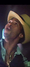
The idea is to come up with a particular shade of a particular color which can be optically "removed" in the various visual-effects compositing processes.
If I recall correctly, the use of blue created some problems with Superman's blue outfit: parts of him would disappear along with the blue background at times.
If I had to guess, I'd say that the particular shade of green in use now has been determined to have the smallest number of corresponding same-colored objects in modern movie sets and costumes.
|
|
|
|
|
|
|
|
|
|
|
 |
Posted: |
Feb 11, 2013 - 12:48 PM
|
|
|
|
By: |
manderley
(Member)
|
.....Can someone enlighten me? Will we ever see RED or YELLOW Screen in the future?.....
Maybe in the future, but certainly in the past.
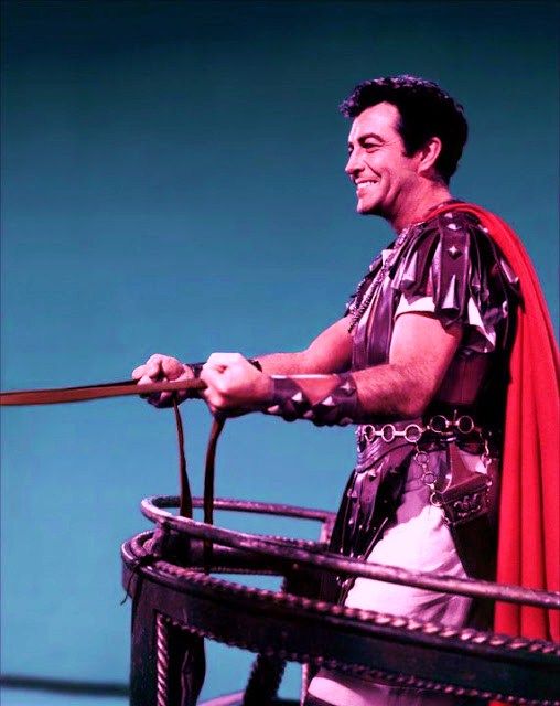
In the late 1940s-early 1950s, MGM was trying all sorts of colored screens for their Technicolor films.
Included among these is THE TOAST OF NEW ORLEANS (1950, with Mario Lanza)....which I believe is green screen, several shots in PAGAN LOVE SONG (1951, with Esther Williams).....which I believe are yellow screen, a sequence in ANNIE GET YOUR GUN (1950, with Betty Hutton).....which appears to be red screen, some shots in SCARAMOUCHE (1952, with Eleanor Parker).....which appear to be blue screen, etc.
THE GREATEST SHOW ON EARTH is rife with travelling mattes, using, I think, red, green, blue, and yellow screens, and several of which appear to use magenta colored screens.
Disney used "sodium" (which looks to the eye on a soundstage as yellow), and in the 1960s, Walter Beyer---who was a Director of Engineering at Universal---was a big proponent, working with the Technicolor Corp, of the recently-developed "color difference" system---now using Eastman Color negative (rather than 3-strip Technicolor)---which involved the green-blue color spectrum---when pulling out male-and-female mattes.
|
|
|
|
|
|
|
|
|
|
|
|
|
|
|
|
|
|
|
|
|
|
|
|
|
|
|
environmental concern?
|
|
|
|
|
|
|
|
|
|
|
|
|
|
|
|
|
|
|
|
|
|
Any color can be used for the matteing process, but blue is easiest to use with film and green is easiest to use with digital/video compositing. Neither color is foolproof in its use, so red and yellow are also acceptable. Any decent video editing set-up will allow you to use pinpoint any color in a frame for the chroma-key process.
I just watched Quo Vadis? from 1951. It has some very obvious Blue-Screen work for the chariot sequence toward the end. I would have expected rear-projection considering the time period, but the matteing looked much better apart from obvious blue matte lines. The Burning-of-Rome sequence was much more convincing.
|
|
|
|
|
|
|
|
|
|
|
|
|
|
|
|
|
Posted: |
Feb 11, 2013 - 9:05 PM
|
|
|
|
By: |
Metryq
(Member)
|
Bluescreen is just one type of "automatic" matting process. First you have to know what mattes are.
If you make two exposures on the same frame of film, you will get a ghost-like effect. Mattes are "masks" that allow you to control which portion of the frame is exposed. Thus, if you have a positive and a negative of the same matte, they will fit together like jigsaw puzzle pieces. Creating mattes by hand is called rotoscoping. (Actually, rotoscoping is hand tracing some other piece of film as a reference. The technique was invented by Max Fleischer.)
If you photograph someone in front of a bluescreen, the blue can be extracted with a lab process. Red and blue are contrasting colors. That is, the blue background will appear black on the red channel, yet white on the blue channel. If you make a negative of the red channel, the background becomes white. Also note that the dark and light areas of the foreground subject are now reversed. So if placed on top of each other, one gets a black silhouette on a white background. This is one half of the matte. Just make a negative of that, and you are ready to composite your images.

On film, the white areas are clear. So if the white silhouette is stacked on top of the original color film and rephotographed, the result will be the foreground subject against a black background. That black background is basically unexposed. But the copied film isn't developed yet. The black silhouette is layered on top of a background scene and then used as a second exposure. When the "double exposed" film is developed, the result is a composite with no ghosting.
There are many, many different automatic matting techniques, including techniques that use special lighting, such as sodium or UV lighting. Bluescreen is one of the simplest techniques on film, which is why it became so widespread. Video can also key with blue, or just about any color—and it doesn't stop there. But as with film, a blue background became commonplace.
The reason for switching to green is not because people have blue eyes, or want to wear something blue. (Although there have been many cases of blue eyes keying out, and people tend to wear blue more often than green.) In video, green makes up over 50% of the signal, with red and blue dividing the remaining portion. Blue is actually the least portion of a video signal, and thus "noisier." (Blue is only 21%, if I'm remembering correctly.) Thus, green became the go-to color for nice, clean composites.
(And it doesn't stop there. With digital tools, one can extract a foreground subject from almost any background. For example, take two shots of a detailed scene, such as a library. One photo is just the library, while the other is the same scene with a person in it. A digital comparison can null out the background because it matches in both images and keep the person. Wild, huh?)
|
|
|
|
|
|
|
|
|
|
|
|
|
|
Posted: |
Feb 16, 2013 - 4:35 PM
|
|
|
|
By: |
manderley
(Member)
|
Not exactly on topic, but not without any relevance, either.
http://www.bbc.co.uk/news/technology-21463817
It's always sad when a real pioneer and technical "thinker" like Vlahos ends his time in
the industry.
.....He also noted in a patent filing that the process allowed the blue-screen procedure to cope with glassware, cigarette smoke, blowing hair and motion blur which had all caused problems for earlier efforts.....
This blue-green development is the "color difference" system I was referring to in my early post above. As indicated, it was very important because glassware, cigarette smoke, blowing hair, motion blur and other similar visual elements would previously "break up" in the final mattes, causing strange partial see-through effects or incomplete mattes. The "color difference" system went a long way to improving that.
The "sodium matte" system, used primarily by Disney was quite effective, but the major drawback was that it required the use of an old Technicolor 3-strip camera with its beam-splitter prism, adapted for use in the process. The prism required very high light levels on the set, and the Technicolor camera never allowed anamorphic lenses to be used on the camera because the prism blocked too much light, and the whole set up, with anamorphic lens, would have been quite fuzzy in reproduction. (That's why Technicolor cameras were never used in CinemaScope or the other anamorphic processes and why Eastman Color negative got a strong foothold in industry.) For many years, Disney, because it was primarily shooting spherical wide-screen features could still use the sodium process for its films.
I remember shooting some material in sodium in the late 1960s for a Disney film I was working on. It was slow to set up and light, but was quite efficient in the final outcome.
My biggest memory of the shoot was of how vivid the canary yellow color was to the eye on that massive backing screen!
|
|
|
|
|
|
|
|
|
|
|
|
| |
|
|
|
|
|
|
|
|
|