|
|
|
|
|
|
|
|
|
|
|
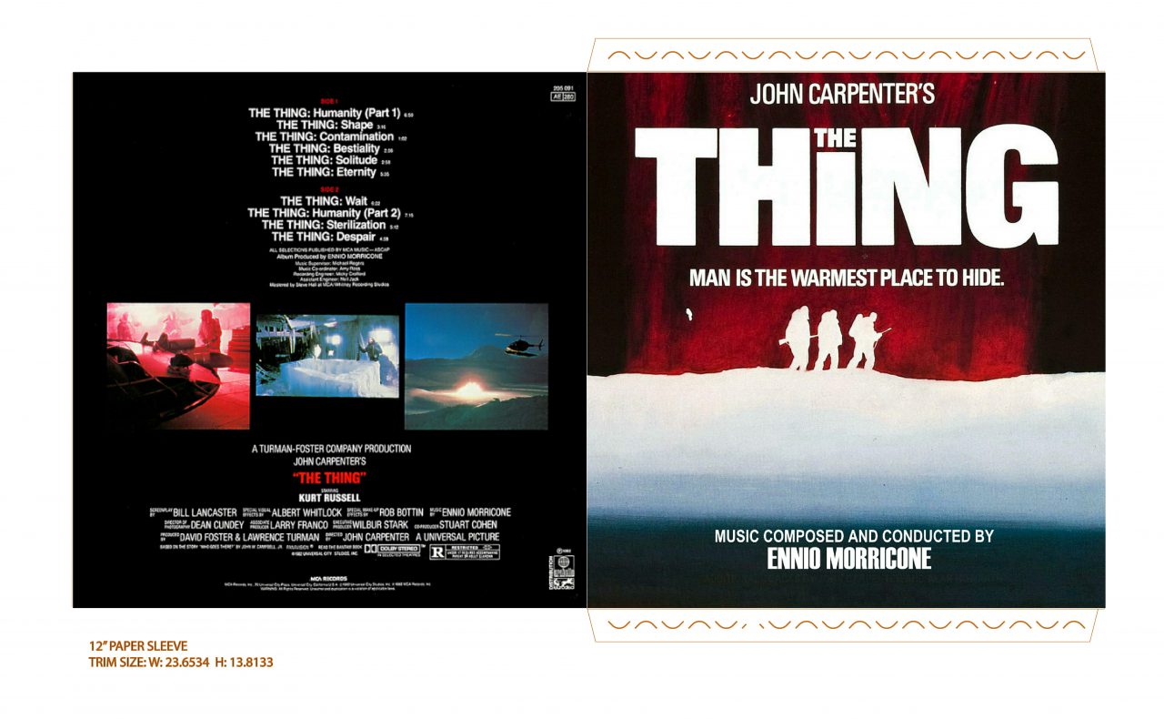
Okay, I finally have my own (extremely humble) contribution to this thread, due to two funny little quirks of my preference:
1. I often like to use original LP covers for LP programs unless they are particularly painful for one reason or another.
2. I prefer separate scores be split up into their own albums in iTunes.
Both of these little quirks of mine resulted in me slightly modifying both late Dimitri Tiomkin covers so that each of the four film scores gets its own album with unique cover in iTunes. Not much to it, since it was really just cut-n-paste (no enlarging because I didn't want to pixelate the text), but I did tweak a few other things besides placement, like removing the Bruce Ogston credit from The High and the Mighty since he only performs on Search for Paradise.
Aside from those two quirks of mine, I also felt these deserved four separate covers, because both Tiomkin LPs in the series, though released respectively in 1978 and 1979, were actually both recorded at the same sessions in 1978, so it felt weird grouping them into two different albums in iTunes; IMO there should either be four separate albums or one combined album.
I'm sure raferjanders could do amazing covers for each individual film in the Elmer Bernstein Film Music Collection if he wanted to, but in this case the original covers aren't garish to me...they're just rather low-tech, but in a way I find rather charming, concentrating on the composers themselves (and I liked the consistent look across his series; made them feel like a family). So for anyone else who feels like me, here ya go:


Before anyone asks, yes, I did do the same for Elmer Bernstein's The Miracle/Toccata for Toy Trains...but I had to enlarge the text for the latter since it was so small, slightly pixelating it, so I'm not entirely happy with the result.
Yavar
P.S. I'm not sure who provided them, but I got the original HQ scans for these from this fine LP covers site:
https://lpcover.wordpress.com/
|
|
|
|
|
|
|
|
|
|
|
|
|
|
|
|
|
|
|
|
|
|
|
|
|
|
|
No suggestions, I'll leave it in your very capable hands and look forwards to what you come up with.
|
|
|
|
|
|
|
|
|
|
|
|
|
|
|
|
|
|
|
|
|
|
|
|
|
|
|
|
|
|
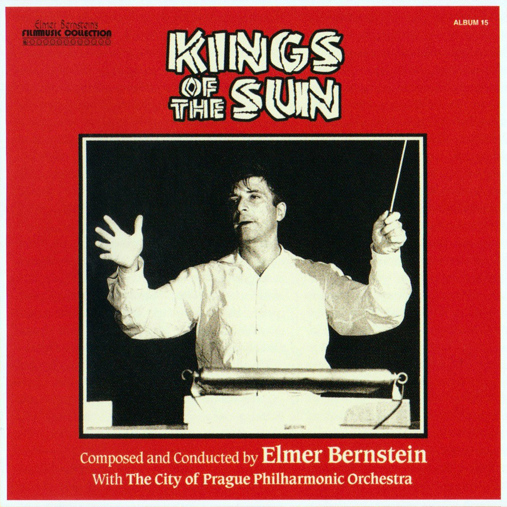
That KINGS OF THE SUN layout was originally mine. Tons of work involved in combining two different sources, matching colors, repairing tears and folds, etc. Then I think Josh "Swashbuckler" Gizelt did a little reworking of the text and moved it close to the borders. That looks like his version you've posted.
Yes, that was the variation I made to your original (frankly awesome) design.
|
|
|
|
|
|
|
|
|
|
|
|
|
|
|
|
|
|
|
|
|
|
|
|
|
|
|
|
|
|
|
|
|
|
|