|
|
|
|
|
|
|
|
|
|
|
|
|
|
|
|
|
|
|
|
|
 |
Posted: |
Jan 23, 2021 - 11:53 AM
|
|
|
|
By: |
Elgar
(Member)
|
I hope this doesn't come across as too off-the-wall, but I've been thinking a lot lately about how different album art affects what particular release I listen to. The example for me that kicked this off was actually Mark Mancina's score to Speed. As much as I love and appreciate La-La Land expanding and releasing the score, I still find myself enjoying it slightly more on the original Milan release. I thought this might be the track order that I was just more used to by that point. The start of the film and hence the start of the LLL release feature less impactful and less exciting music, to my ears, so feels a little slow to start. But it's still enjoyable. It soon clicked for me that as I am more of a 'digital' listener now, and album art is essential for my library to keep it organised, the brighter look to the Milan release draws me in when choosing which rip to play.
I realise this is made all the more bizarre by the fact that the LLL album features art far closer to the original promotional material, while the Milan release has art that is bright, a little garish and inconsistent with other marketing for the movie (if anything to prevent it from being confused with the song album released for the film around the same time). It even appears printed a little 'inkjet fuzzy' on the front cover.
Perhaps this is a testament to putting a CD into a CD player, sitting back, and just enjoying the music, and to that I have to concede. But having a digital collection while working is too convenient an option to pass up. I could always minimise the player, but I think the subconscious influence is ingrained by that point.
Has anyone else ever experienced this phenomenon? If so, which album/releases influenced which one you listened to in a given moment?
|
|
|
|
|
|
|
|
|
|
|
|
 |
Posted: |
Jan 23, 2021 - 12:07 PM
|
|
|
|
By: |
Thor
(Member)
|
It's a good question, Elgar.
These days, I listen to most of my music digitally on my computer, like you. So I only have the small iTunes art to relate to anyway.
But if we go back some 10-15 years, it's a different story. I remember when I got CD-Rs of rare scores back then, without any artwork, I didn't quite "connect" to the music as much as when I listened to my regular CDs - which I put upright on the speaker while playing, in a record store-type "Now Playing" mode. Occasionally glancing over to the CD while listening added the feeling that it was an 'event'. That's rarely the case these days.
However, at some point I expect to both start playing my CDs again, as well as installing my turntable. When that happens, I will again place the CD or LP upfront in a "Now Playing" mode.
|
|
|
|
|
|
|
|
|
|
|
|
|
|
|
|
|
|
|
|
|
|
|
|
|
|
|
|
|
Posted: |
Jan 23, 2021 - 2:55 PM
|
|
|
|
By: |
Graham Watt
(Member)
|
It is a good topic. It's easy to say, "It's all about the music", and yes, I suppose it should be, but for me it's more than that.
Good packaging in a general sense gives a product a sense of importance, of its being an experience, a labour of love in the best of cases. And that includes the cover artwork - which in some instances is almost "accidentally" attractive.
Just rabbitting on with no goal in mind except the rabbit itself, I feel myself drawn to LPs more than CDs, because they're "big". When I play those LPs it accentuates the greatness of the music. It can make the mediocre great. It can make the very bad almost mediocre, which is a help. But having said that, I'm very used to the pleasure of CDs nowadays, and not at all excited by downloads, no matter how good the music is. Thus spake Dinosaurus.
I have an LP by Elmer Bernstein. I can't remember the name of the film because I never play it, and that's because the cover is George Peppard sitting at home, smiling into the camera with his dog beside him. Same goes for non-soundtrack LPs I have. I remember one with Dave Grusin on the cover, lying back in a haystack (?) with a bit of rye/wheat (?) between his teeth. The music is probably very good. I may never know.
Off the top of my head, and regarding CDs, I never play the CD-Rs which some friends have immorally made me throughout my pathetic lifetime, unless they have reproduced the (good) original artwork on photographic paper. One friend made me an immoral copy of Silvestri's PREDATOR, a score I love, but seeing that he photocopied the cover in black and white - and on a square of toilet paper - I never listen to it.
Back to LPs in my streamofconsciousness state of mind, I love the music for Lalo Schifrin's KELLY'S HEROES on LP because the cover art is so good. It even makes "All For the Love of Sunshine" bearable.
There are many more observations to come out of this topic, but for now we must endeavour to make sense of the previous paragraphs.
|
|
|
|
|
|
|
|
|
|
|
|
|
|
|
|
|
|
|
|
|
|
|
|
|
|
|
I do find myself slightly put off by poor cover art and certainly can feel my mood or feelings enhanced by good artwork. Think that’s why I enjoy the custom artwork. Plus I like having a range of artwork if I have different versions of something (expanded/original album/bonus tracks/FYC etc).
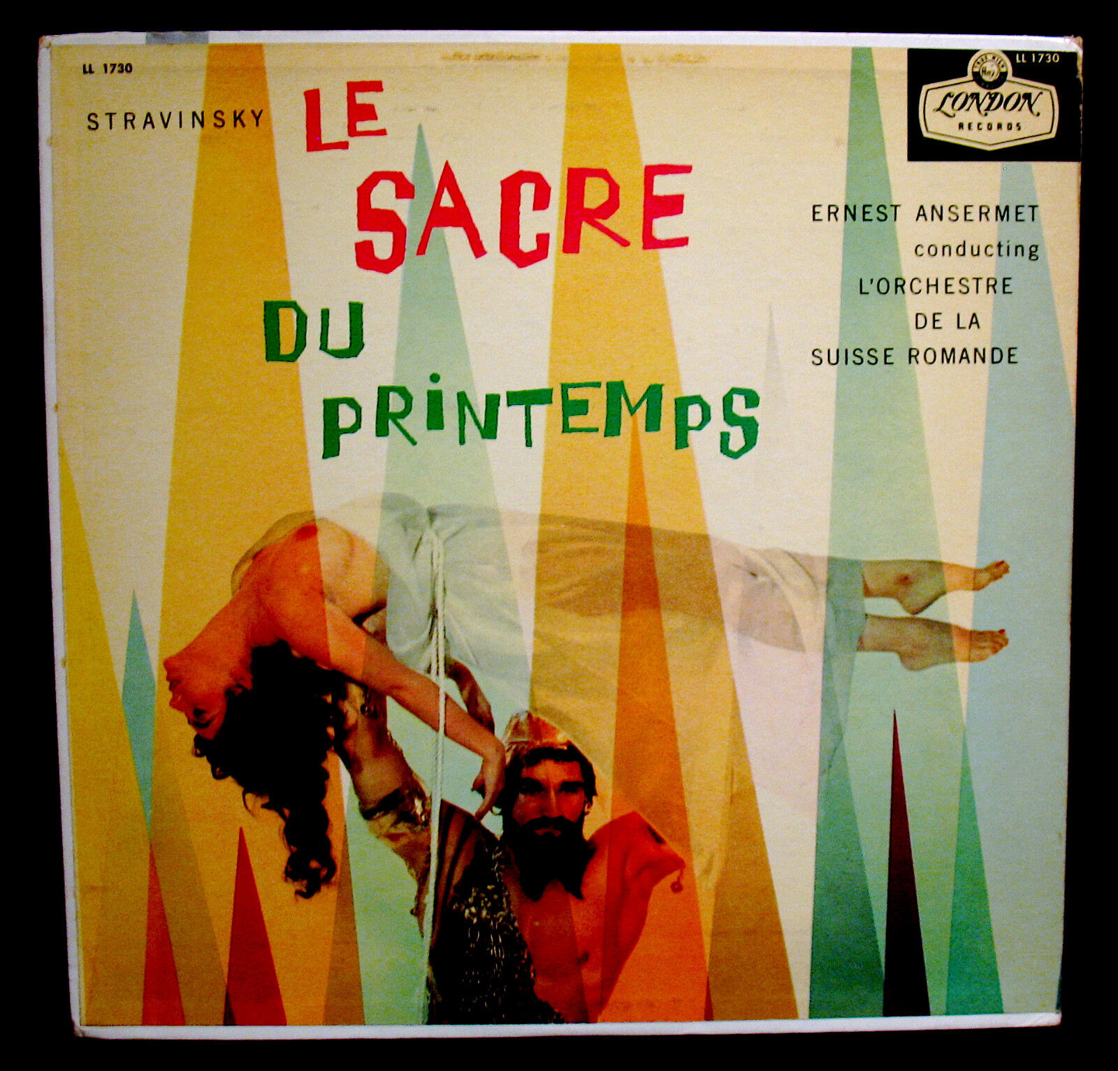
Although in terms of buying, I find myself more influenced by artwork for classical music. Sometimes it’s a dull (or awful) picture of the conductor or soloist (or both) or something abstract or a painting that somehow reflects the music or era or subject. Some labels have their standard designs, notably Naxos which I find does make their stuff seem less appealing with all the white space although it’s much more attractive now than it used to be. Similar for BIS (which as I may have mentioned before) is my favourite classical label. Their older releases had horrible thick black borders enclosing a small picture or painting. Plus with awful large white text. Fortunately they have changed and now feature much more attractive artwork mixing the usual pictures of the artist or other appealing artwork.
|
|
|
|
|
|
|
|
|
|
|
|
|
|
|
|
|
|
|
I love album cover art and have 30 or so framed album covers in my library/music area. Ideally, I would have great album art for every album I own, but if I don't, my enjoyment of the music is not lessened.
I do really enjoy when the cover art matches perfectly with the music.
Miles Davis's headshot on In a Silent Way is perfect.
The wild, colorful artwork of Miles's Bitches Brew captures the expansiveness and exotic nature of the music.
John Barry's shadowy black and white portrait on Conducts His Greatest Movie Hits matches the stark quality of "Dutchman" and "The Whisperers."
Mayan artwork on Revueltas and Chavez albums work for me.
The Francis Wolff smoky portraits of jazzbos for Blue Note Records.
I also love classical covers from the 50s with abstract art.
And the Nonesuch Explorer covers with their colorful art depicting cultures from around the world.
|
|
|
|
|
|
|
|
|
|
|
|
|
|
|
| |
|
|
|
|
|
|
|
|
|