Film Score Monthly
FSM HOME MESSAGE BOARD FSM CDs FSM ONLINE RESOURCES FUN STUFF ABOUT US  SEARCH FSM   
Search Terms: 
Search Within:   search tips 
You must log in or register to post.
  Go to page:    
 
 Posted:   Dec 12, 2010 - 10:19 AM   
 By:   CinemaScope   (Member)

Too right! Film posters these days are as boring as hell, you can walk past them & not notice them. Vintage posters are a work of art. My favorite decades are the 50's & 60's (also my favorite decades for films). Maybe studios don't think posters are that important anymore. In the 60's a lot of shops displayed movie posters (just under the window), I'd walk past five or six on the way to school. Those fantastic Roger Corman Horror posters, the Hammers, all sorts of great stuff. You see them & just ache to see the film. Oh, nothing's what it was, you can't even get a decent custard tart these days!


 Posted:   Dec 12, 2010 - 5:30 PM   
 By:   Bob DiMucci   (Member)

Sorry but it ain`t that one either. It is described in the mag as this: "...which reflects the encroaching darkness of the franchise, plays up the iconography Harry`s Lennon specs and does a rather cute mash-up of the Potter scar with Voldemort`s profile."

For those who have the issue with the Tintin cover it is on page 34.


I've looked at nearly 70 different "Deathly Hallows" posters, but I haven't seen that one.

 
 Posted:   Dec 12, 2010 - 7:10 PM   
 By:   Paul MacLean   (Member)

Most modern movie posters are dull I agree. But I have to say that posters that use images from the films tell me more about the film itself than an illustration does.

This would make me want to see what looks like an intriguing, edgy, visually-inventive film:


This would make me not want to see what looks like an animated movie:

 
 Posted:   Dec 12, 2010 - 11:12 PM   
 By:   BobJ   (Member)

Most modern movie posters are dull I agree. But I have to say that posters that use images from the films tell me more about the film itself than an illustration does.

This would make me want to see what looks like an intriguing, edgy, visually-inventive film:


This would make me not want to see what looks like an animated movie:


Couldn't disagree more. That top poster is a mess, while the lower one (I have it hanging in my room) is filled with mystery and atmosphere. I grew up in a small town and literally saw the poster before any trailer and I couldn't wait for the film to be released.


 Posted:   Dec 13, 2010 - 1:20 AM   
 By:   Thor   (Member)

I agree wholeheartedly with Storyteller. The latter - more famous - poster is vastly superior to the former, which looks like a cheap direct-to-video film.


 Posted:   Dec 13, 2010 - 5:34 AM   
 By:   Hurdy Gurdy   (Member)

Yep. Me agree too!
The bottom one is way better than the horrible cut-and-paste top jobbie.
BUT!!!!
Even better than both, is Drew Struzan's blue tinged anniversary poster that he did for BLADE RUNNER.
And if I wasn't such a dinosaur, I would include it in my post frown

 
 Posted:   Dec 13, 2010 - 9:24 AM   
 By:   musiconfilm   (Member)

The thing is, the studios are terrified that if they don't sell you on the big stars, you won't care about the movie. And, I'm sad to say, when it comes to the modern ADD unwashed masses they're right. I'm always surprised when I mentioned some huge new release like Inception to a non-cineaste and they ask "Oh, is that that new movie with DiCaprio?" $50 million in advertising and all they remember about it is who the star is.

 
 Posted:   Dec 13, 2010 - 9:52 AM   
 By:   Paul MacLean   (Member)

I agree wholeheartedly with Storyteller. The latter - more famous - poster is vastly superior to the former, which looks like a cheap direct-to-video film.

Though no cheap direct-to-home video movies had that inventive style of lighting or art direction at the time.

Don't get me wrong, there are a lot of poster illustrations I like (Bob Peak's work stands-out to me for instance). Movie poster art can be wonderful, but practically-speaking, a movie poster ought to sell a movie. To me it is more logical it to exhibit stills or actual images from the film rather than an artist's (sometimes skewed) visual interpretation of the film (particularly with an unusual film like Blade Runner, for which audiences had no frame of reference at the time).

I think these are all great movie posters...


 Posted:   Dec 13, 2010 - 9:18 PM   
 By:   Thgil   (Member)

I couldn't agree with the thread more. The only notable posters I've seen of late seem to be Inception related...

http://cdn.screenrant.com/wp-content/uploads/Ellen-Page-Inception-The-Architect-Poster.jpg

and

http://cdn.screenrant.com/wp-content/uploads/Marion-Cotillard-Inception-Shade-poster.jpg

I strongly prefer the former, but both are quite visually interesting. I find it worthy of noting that, in my opinion, the posters for the female characters are more visually engaging than those for the males.

http://cdn.screenrant.com/wp-content/uploads/Tom-Hardy-Inception-The-Forger-Poster.jpg

and

http://4.bp.blogspot.com/_oH21HOn8uNc/TDrzAeviocI/AAAAAAAACg4/VdRdf16J0ww/s1600/inception+tourist.jpg

The latter seems more engaging than the other male posters; about as much as the one for 'The Architect', though I still prefer that one. It's more alive.


 Posted:   Dec 14, 2010 - 12:42 AM   
 By:   Bob DiMucci   (Member)

Five Reasons Why Old Movie Posters Are Better Than Current Movie Posters

1. Old Posters Are Brighter Looking – Most illustrators drawing a poster begin with a white canvas. Consequently, the parts of the poster not covered by artwork or credits are often left white, or shaded in some other light/bright color. When using photography, the actors’ photos that are often used must be placed against some realistic background, which more often than not is relatively dark (such as a building), or against a color wash, which is usually dark blue or gray.

2. Older Posters Are More Colorful – Illustrators are not limited to colors that appear naturally, and can use whatever colors are most striking and eye-catching for the subject at hand. For example, the color yellow often appears in posters as part of the background to the illustration. Yellow is not a color that appears naturally very often in photographs.

3. Credits Are Easier To Read On Older Posters – Because older posters often have white backgrounds while new posters have dark backgrounds, the black on white older credits are much easier to read than the white on dark modern credits. (Also, why do modern posters all tend to use the same tall, skinny unreadable font for their credits?)

4. Composite Illustrations Are More Convincing Than Photo Collages – By the skillful use of color and perspective, an artist can put multiple elements of a film together in one illustration (actors, action scenes, locations) without them looking jumbled or out of place. This is much harder to accomplish with photographs, and is rarely attempted.

5. Illustrations Are More Exciting Than Photos The artist can often take poetic license with the elements of the illustration, for example, by changing the proximity of characters in a scene, heightening the power of explosions, using perspective to emphasize a particular element of a scene, or providing a dramatic angle to action that actually wasn’t captured in that exact way by the cinematographer. Photo arrays can only work with what was actually filmed or photographed.

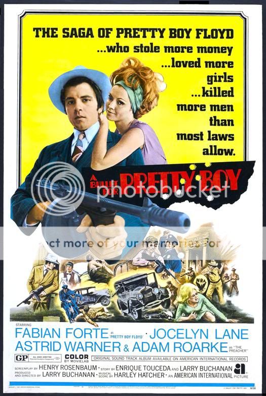
The following two posters generally illustrate the above points:


 Posted:   Dec 14, 2010 - 1:50 AM   
 By:   Michael24   (Member)

Yep. Me agree too!
The bottom one is way better than the horrible cut-and-paste top jobbie.
BUT!!!!
Even better than both, is Drew Struzan's blue tinged anniversary poster that he did for BLADE RUNNER.
And if I wasn't such a dinosaur, I would include it in my post frown


This one, correct?


Was that done in 1992? I recalled never seeing it until 2007 and thinking it was new artwork done up for "The Final Cut," like it says, then later realized it was an existing poster when I saw it in some older publications.


 Posted:   Dec 14, 2010 - 2:47 AM   
 By:   CinemaScope   (Member)

That last Blade Runner poster looks so crude.


 Posted:   Dec 14, 2010 - 3:39 AM   
 By:   Hurdy Gurdy   (Member)

Thanks GF, that's the one. To me, it really captures the rain and the neon that permeates the film. I love it.
I can't remember when Drew did that one, I'm sure it will say in one of his book collections, of which there are 3, I think.
I probably like that one the most, although the original poster art is the one most ingrained into my memory.
Some good points raised by Bob about the older painted/airbrushed ones being brighter and more flexible. I know which I prefer.
Most of todays posters bore me rigid.


 Posted:   Dec 14, 2010 - 7:33 AM   
 By:   Nostromo   (Member)

Yes, who could forget the imagination that went into movie posters like Star Wars. White lettering on a pure black background. :-P

I think that that poster is a great example of minimalism that works. The white lettering in that font starkly contrasted by the black background is instantly iconic. It's not about how much content is on the poster, but how it is executed.

 
 Posted:   Dec 14, 2010 - 7:38 AM   
 By:   LeHah   (Member)

The other things thats died with good poster art? Good taglines. I really, really like a good or cheesy tagline with a film - especially when it came to old drive-in movie monster stuff.


 Posted:   Dec 14, 2010 - 11:24 AM   
 By:   Vermithrax Pejorative   (Member)

Yeah LeHah, taglines were cool!

IMAGINE YOUR WORST FEAR, A REALITY (The Howling)
IF YOU'VE GOT A TASTE FOR TERROR, TAKE CARRIE TO THE PROM (er, Carrie)

It's the domino effect. All the good stuff starts to fall frown


 Posted:   Dec 14, 2010 - 11:49 AM   
 By:   Bob DiMucci   (Member)

The other things thats died with good poster art? Good taglines. I really, really like a good or cheesy tagline with a film - especially when it came to old drive-in movie monster stuff.

That has the makings of a great game.

Here are five poster taglines. Guess the films they describe. Hint: all are 1965 films.

------------------------------------------------------------------------------------------------------------

The Rollicking Story of a Ribald Century That Really Should Have Been Ashamed of Itself!

Don’t Call Him No Damn Good . . . Not In Front of Her!

The Most Intensely Personal Drama of Men Ever Told.

He’d Take on Anyone, at Anything, Anytime . . . It Was Only a Matter of Who Came First!

Only Once In the Furied History of Adventure and Conquest . . . Did One Man Rule So Vast an Empire!

 
 Posted:   Dec 14, 2010 - 11:58 AM   
 By:   LeHah   (Member)

That second one and last one are absolute GOLD. (No clue what movies they're from but hell, I like the sound of 'em!)

 
 Posted:   Dec 14, 2010 - 3:14 PM   
 By:   Bernd   (Member)

Taglines from Abrahams/Zucker productions:


Top Secret - A Film

The Naked Gun - You've read the ad, now see the movie!

The Naked Gun 2 1/2 - If you see only one movie this year...you ought to get out more often.

The Naked Gun 33 1/3 - The single most important filmmaking event since Naked Gun 2 1/2!

 
 Posted:   Dec 14, 2010 - 3:16 PM   
 By:   Bernd   (Member)


The Most Intensely Personal Drama of Men Ever Told.


That must be "The Battle Of The Bulge", no?!

 
You must log in or register to post.
  Go to page:    
© 2024 Film Score Monthly. All Rights Reserved.
Website maintained and powered by Veraprise and Matrimont.