Film Score Monthly
FSM HOME MESSAGE BOARD FSM CDs FSM ONLINE RESOURCES FUN STUFF ABOUT US  SEARCH FSM   
Search Terms: 
Search Within:   search tips 
You must log in or register to post.
  Go to page:    
 
 Posted:   Dec 12, 2010 - 2:35 AM   
 By:   Bob DiMucci   (Member)

The hour glass image here is attention-getting and imaginative.


 Posted:   Dec 12, 2010 - 2:40 AM   
 By:   Bob DiMucci   (Member)

A "Jaws" rip-off, but so's the film.


 Posted:   Dec 12, 2010 - 2:48 AM   
 By:   Bob DiMucci   (Member)

I don't recall this film playing near me, but I'm sorry I didn't get a chance to see it.

 
 Posted:   Dec 12, 2010 - 2:51 AM   
 By:   LeHah   (Member)


Rather fond of this throwback type style.


And I like this one so much I've considered putting it up in my living room.


 Posted:   Dec 12, 2010 - 2:59 AM   
 By:   Bob DiMucci   (Member)

Something other than a straight character pose here.


 Posted:   Dec 12, 2010 - 3:10 AM   
 By:   Bob DiMucci   (Member)

Yeah. Modern posters suck ass. The new Tron looks nice though.

This version's not bad.


 Posted:   Dec 12, 2010 - 3:17 AM   
 By:   Bob DiMucci   (Member)

Your choice - with or without headshots.


 Posted:   Dec 12, 2010 - 3:34 AM   
 By:   Bob DiMucci   (Member)

Sure it's headshots. But it's got some life to it. Most posters for animated films can't say as much. Look at the static group illustrations in the last two.


 Posted:   Dec 12, 2010 - 3:37 AM   
 By:   Bob DiMucci   (Member)

For comparison, here's one of the worst posters of the year. Think of all of the great action set pieces, stunts, and locations that could have been excitingly illustrated for a movie such as "Salt." Instead, here's what we got:


 Posted:   Dec 12, 2010 - 3:39 AM   
 By:   Bob DiMucci   (Member)

Here's something to look forward to for 2011.


 Posted:   Dec 12, 2010 - 4:10 AM   
 By:   Bob DiMucci   (Member)

Here's my classic illustration of the difference between the poster designers of yesterday and the designers of today:

1971 Poster


2006 DVD


 Posted:   Dec 12, 2010 - 4:43 AM   
 By:   Bob DiMucci   (Member)

Another old vs. new comparison.


 Posted:   Dec 12, 2010 - 4:48 AM   
 By:   Tobias   (Member)

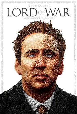
Just finished reading Frank Darabont's foreword in the latest collection of Drew Struzan's movie poster paintings, and although he comes off sounding like a grumpy old git - which he freely admits - he is dead right about one thing. Film posters these days, or should I say composites, well and truly SUCK!!!
They are soooo boring and unimaginative.
I really miss the works of art by Amsel, Struzan, Peak etc.
Now we just get photoshop paste-it's from some zero in marketing!
I think the last one I saw, in the current day standards, that looked half decent was the Dark Knight poster, with the bat sign in flames on the building behind Batman.
What do others think?


I read that in Empire Movie Magazine and they thought that the movie poster for the new Harry Potter should be an exception. Anyone else saw that?


 Posted:   Dec 12, 2010 - 4:55 AM   
 By:   Thor   (Member)

As others have pointed out (and illustrated above), the movie poster artform is still alive and well. I'd say the good/bad ratio is pretty much the same as it always has been. We've done this topic a few times, and the last time we did it, I posted this cool, retro poster for a Norwegian film released earlier this year (and produced by an acquaintance of mine):


 Posted:   Dec 12, 2010 - 5:05 AM   
 By:   Bob DiMucci   (Member)

I read that in Empire Movie Magazine and they thought that the movie poster for the new Harry Potter should be an exception. Anyone else saw that?

I'm not impressed.


 Posted:   Dec 12, 2010 - 5:18 AM   
 By:   Tobias   (Member)

I read that in Empire Movie Magazine and they thought that the movie poster for the new Harry Potter should be an exception. Anyone else saw that?

I'm not impressed.

'

Nope, it was not that one.


 Posted:   Dec 12, 2010 - 5:31 AM   
 By:   Bob DiMucci   (Member)

I'd say the good/bad ratio is pretty much the same as it always has been.

Well, relatively speaking, I guess I agree. Given the overall level of quality of 2010 posters, there is the same percentage of "good" 2010 posters to "bad" 2010 posters as there was "good" 1970 posters to "bad" 1970 posters. But I think most of us who were watching films in both of those years prefer the style of the 1970 posters, and thus believe that the overall quality of the older posters greatly exceeds the overall quality of today's posters. At the end of the day, it's a matter of choice as to what style one prefers.

1970


2009


1973


 Posted:   Dec 12, 2010 - 5:38 AM   
 By:   Bob DiMucci   (Member)

I read that in Empire Movie Magazine and they thought that the movie poster for the new Harry Potter should be an exception. Anyone else saw that?

I'm not impressed.

'

Nope, it was not that one.


Well, they are all pretty much like that one, single head shots and a few groupings. Except for the initial teaser poster.


 Posted:   Dec 12, 2010 - 7:06 AM   
 By:   Tobias   (Member)

I read that in Empire Movie Magazine and they thought that the movie poster for the new Harry Potter should be an exception. Anyone else saw that?

I'm not impressed.

'

Nope, it was not that one.


Well, they are all pretty much like that one, single head shots and a few groupings. Except for the initial teaser poster.


Sorry but it ain`t that one either. It is described in the mag as this: "...which reflects the encroaching darkness of the franchise, plays up the iconography Harry`s Lennon specs and does a rather cute mash-up of the Potter scar with Voldemort`s profile."

For those who have the issue with the Tintin cover it is on page 34.

 
 Posted:   Dec 12, 2010 - 7:25 AM   
 By:   LeHah   (Member)

With the exception of the Struzan artwork, all the Potter movie posters are as suspect as can be.

 
You must log in or register to post.
  Go to page:    
© 2024 Film Score Monthly. All Rights Reserved.
Website maintained and powered by Veraprise and Matrimont.