|
|
|
|
|
|
|
|
|
|
|
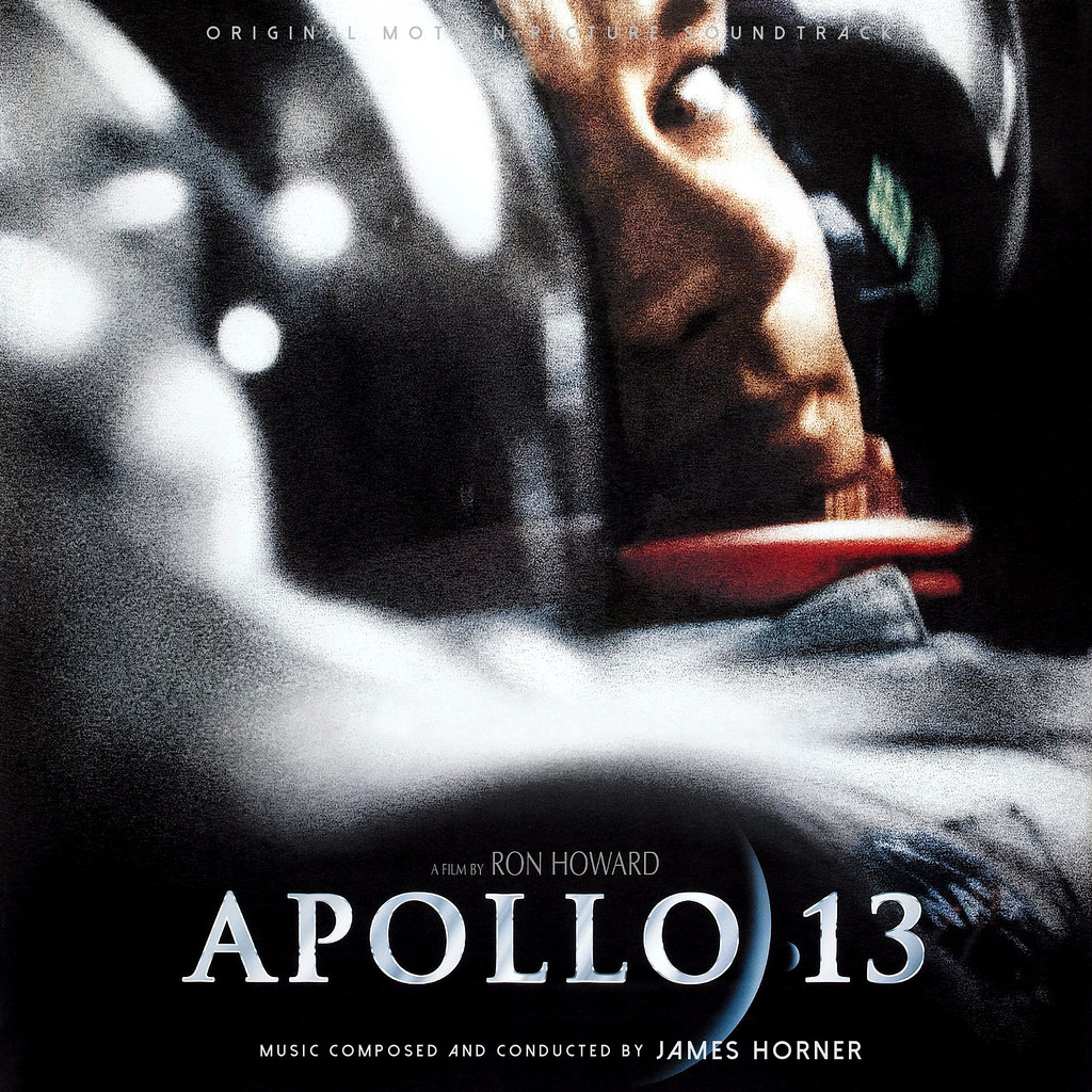
Paul Newman looks like he got caught from behind....
|
|
|
|
|
|
|
|
|
|
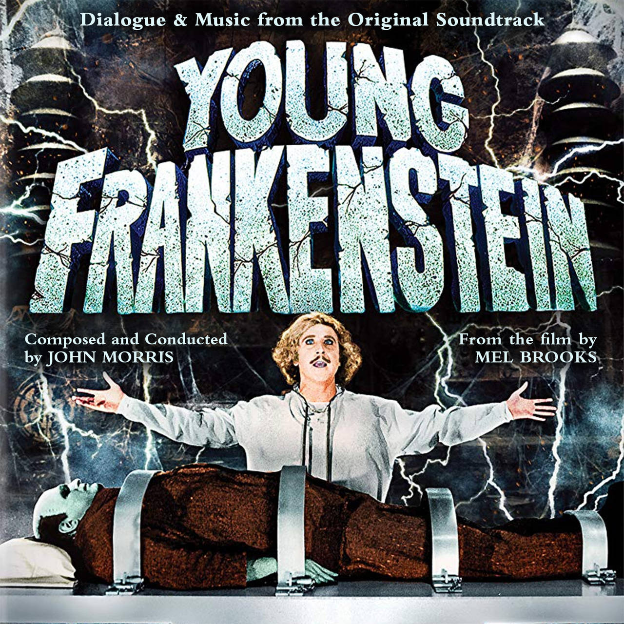
I think it looks great!
|
|
|
|
|
|
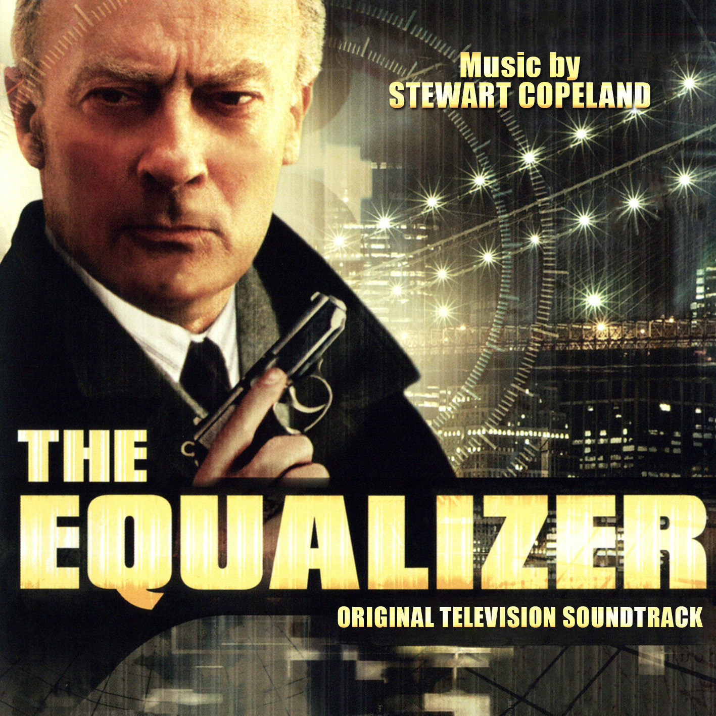
Original motion...
And the
Music compose
That text need to be bigger
And the Title is too Dark. More White
It is what it is ... a designer's prerogative takes precedence. It would be wiser, and certainly more polite to frame your criticism as a request, not a demand.
|
|
|
|
|
|
|
|
|
|
Well... Yes, actually!
You are not commissioning these covers or paying for them so your sense of entitlement is entirely misplaced. I’m very appreciative of all of the great work here and when I’ve asked for some minor adjustments to suit my personal preferences I’ve often got them. But these are people sharing their very impressive and personal work so maybe ask a little more politely rather than rudely criticising and demanding changes to suit you.
|
|
|
|
|
|
|
|
|
|
|
|
|
|
|
|
|
|
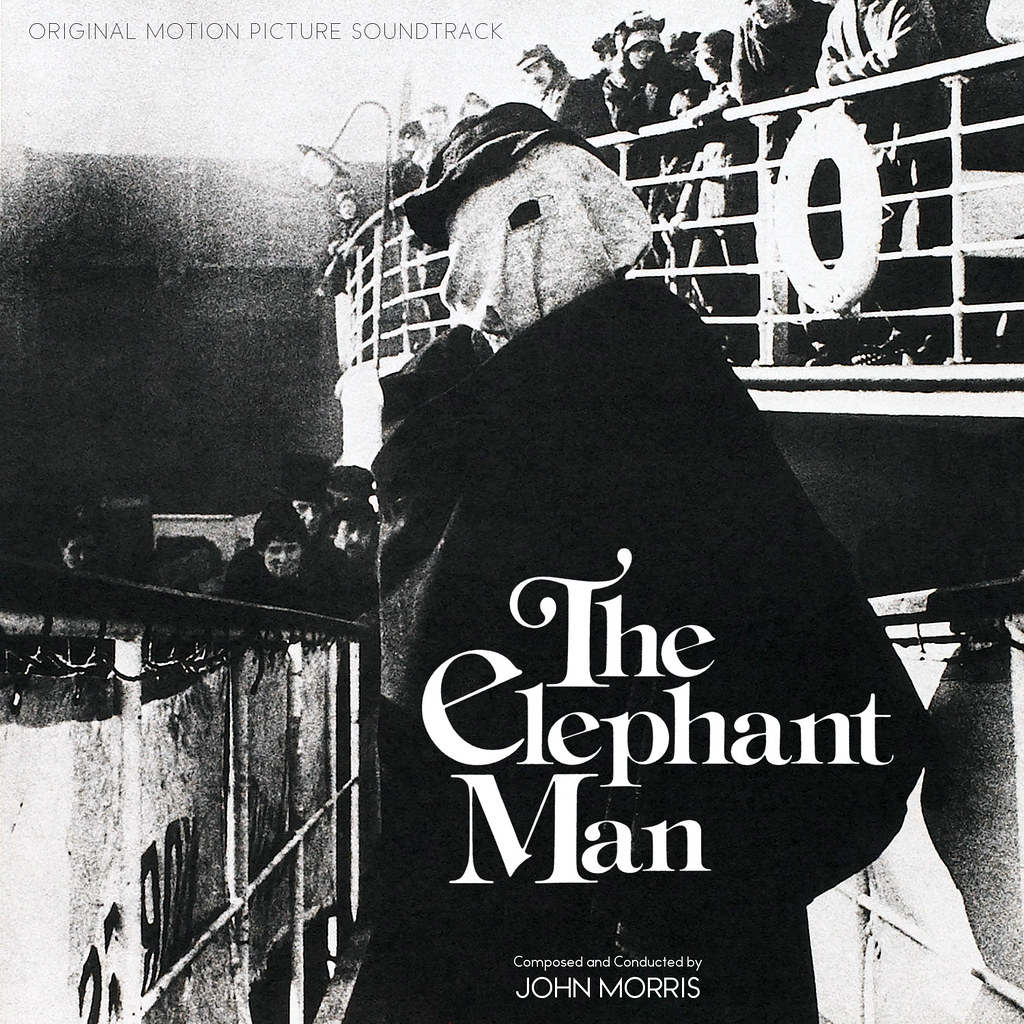
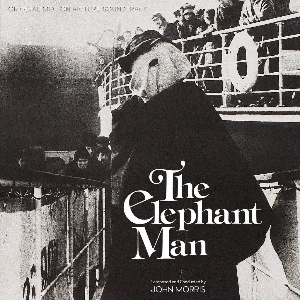
Yes, here is one thread where I will shamelessly kiss ass, because I actually really love the work many of the artists produce. Switching up the art really does wonders mentally for the "same old, same old" scores sometimes. Thank you to all!
|
|
|
|
|
|
|
|
|
|
|
|
|
|
|
|
|
|
Yes, here is one thread where I will shamelessly kiss ass, because I actually really love the work many of the artists produce. Switching up the art really does wonders mentally for the "same old, same old" scores sometimes. Thank you to all!
Completely agree. And the new artwork really does bring new energy to those familiar covers we all know.
Also, LOVE the cover from dtw for Young Frankenstein.
|
|
|
|
|
|
|
|
|
|
|
|
|
|
|
|
|
|
|
|
|
|
|
|
|
|
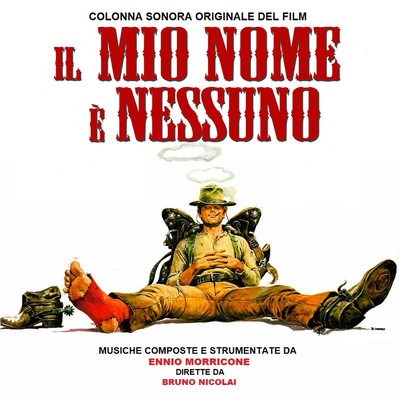
My Name Is Nobody revised LP cover;
|
|
|
|
|
|
|
|
|
|
|