|
|
|
|
|
|
|
|
|
|
|
Oh my God an abundance of riches! Chris, your new The Betsy is perfect! Scott, WOW! I wasn't expecting a custom cover for The Loner to look so amazing! (Where'd you get that HQ still?) And Brad, you'd told me you were working on Sooner, but I wasn't prepared for just how well it would turn out! Holy smokes you guys are all great!
I also dig the new Mister Moses!
Yavar
|
|
|
|
|
|
|
|
|
|
Oh my God an abundance of riches! Chris, your new The Betsy is perfect! Scott, WOW! I wasn't expecting a custom cover for The Loner to look so amazing! (Where'd you get that HQ still?) And Brad, you'd told me you were working on Sooner, but I wasn't prepared for just how well it would turn out! Holy smokes you guys are all great!
I also dig the new Mister Moses!
Yavar
Thanks Yavar!
|
|
|
|
|
|
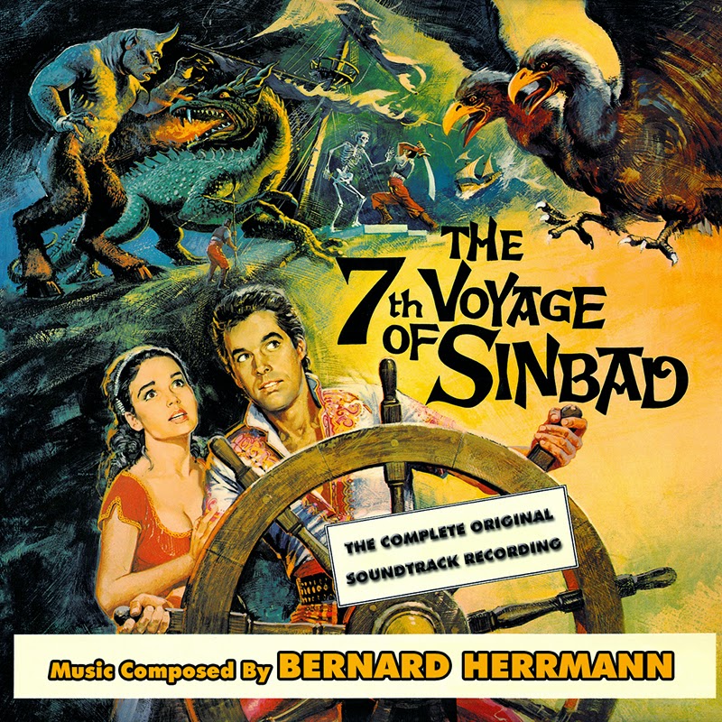
If I'm correct, The 7th Voyage of Sinbad hadn't been done yet. So here is one.
|
|
|
|
|
|
|
|
|
|
|
 |
Posted: |
Mar 8, 2015 - 3:37 PM
|
|
|
|
By: |
Brad Wills
(Member)
|
Yavar thought it might be interesting if I were to post some of the raw materials I used for my custom covers. Here is a small sample. I use large and hi-res images, but as you can see, most of the posters, etc. are in pretty bad shape; discolored and faded, scratched, torn, creased. Sometimes, as in the case with DIANE, a section will be unusable due to text or some other factor. This necessitates the use of sometimes three to four different layouts - 3-sheet, 2-sheet, window display, daybill, etc., - which presents its own set of problems as the conditions vary between resources (DIANE used three different images). I work and finesse and fine tune to remove all scratches and folds (you can't tell from the pic, but SOONER was a disaster), bring out the color, and sometimes even have to create the font from scratch using Font Creator (SOONER again). I hope some of you find interest in this.

|
|
|
|
|
|
Amazing job Brad. I only have done a handful of covers, but luckily I had some decent materials to start from. So they didn't take a lot of time. Looks like you need a lot of patience to color correct the different images used.
|
|
|
|
|
|
|
|
|
|
Great great great
|
|
|
|
|
|
|
|
|
|
|
|
|
|
|
|
|
|
|
|
|
|
|
|
|
|
Wow Scott, I thoughtBrad was my favorite cover artist in this thread, but you sure are giving him a run for his money...
You're all excellent and far better than me if I tried my hand at this, that's for sure...
Yavar
|
|
|
|
|
|
|
|
|
|
|
|
|
|
|
|
|
|
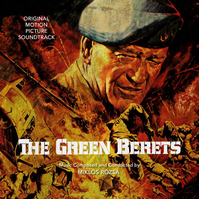
@ Scott and Brad, which font types did you guys use on the Green Beret covers. They look great, and might be useful to me in the future.
|
|
|
|
|
|
|
|
|
|
|
|
|
|
|