|
|
|
|
|
|
|
|
|
|
|
Those are great, Josh. Thanks! Now if Varese could just put out Deluxe Editions of them, darnit!
Here's a bit of a weird request: Has anyone come up with a nice version of Jarre's Behold a Pale Horse based on a cool poster or something? I recently imported the FSM reissue of the Colpix LP. If someone has a nice quality scan of the original cover, that would do as well as it's not horrible. But I thought perhaps someone might be able to come up with better.
Yavar
P.S. I found a nice quality scan of the Damn the Defiant! cover so I don't need that.
|
|
|
|
|
|
How about this?

|
|
|
|
|
|
How about this?
I like it! Tiny request if it doesn't bother you: could the small 'Composed and Conducted by' text run across the bottom to the left of 'Maurice Jarre' or alternatively, be in two lines above it with 'Composed and' and 'Conducted by' together?
Yavar
|
|
|
|
|
|
After I posted the original cover yesterday morning, I felt that I could do another pass on it and improve some of the text blending and colors and whatnot. I figured since I would be revisiting it anyway, I would try to incorporate some of your suggestions.
I was unable to get the “Music Composed and Conducted by” to look good to the left of the “Maurice Jarre” because it was too close to the border of the picture. When I tried different methods of the right justified version, I ran into a similar issue. This is, ultimately, what I felt worked best:

|
|
|
|
|
|
|
|
|
|
|
|
|
|
|
|
|
|
|
|
|
|
Yes! I love your Secret of the Incas and The Edge. I'm not so crazy about the big red box plopped down in the center of the other one, but I do love your new Behold a Pale Horse so MANY THANKS!
Yavar
|
|
|
|
|
|
|
|
|
|
I'm not so crazy about the big red box plopped down in the center of the other one
Neither am I, but that was the only version of that poster I could find, and while I am pretty good at removing text from poster art if I have to, that box was just too big. I tried to do what I could with it.
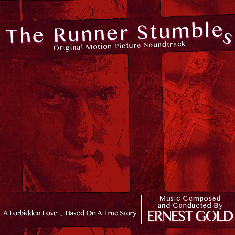
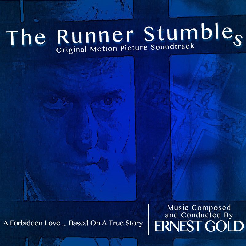
Love the two The Runner Stumbles covers!
|
|
|
|
|
|
|
|
|
|
I'm glad to hear that people are liking these! The ones I'm posting now are mostly new, I'm having a lot of fun with these!
|
|
|
|
|
|
Here is an alternate cover for one of my favorite Intrada CDs. Due to the paucity of decent-looking artwork for the mini-series, I used an excerpt from “Custer's Last Stand” by Edgar Samuel Paxson:

|
|
|
|
|
|
|
|
|
|
|
|
|
|
|
|
|
|
|
|
|
|
|
|
|
|
|
|
|
|
|
|
|
|
|